Institute Exhibition
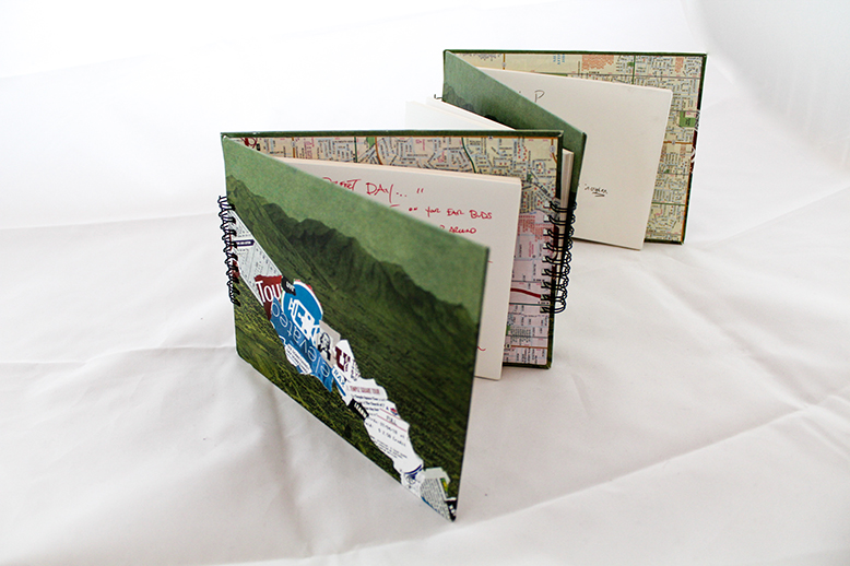
The tour book is one of the most ephemeral of books, whose value depreciates from the moment of publication, as indicated by qualifying phrases such as “the information in this guide was accurate at the time of its publication, but prices cannot be guaranteed.” Reviewers for these guides are almost always anonymous, and the tone of these books tends towards the impersonal. Despite their ephemerality, tour books occupy large spaces in bookstores, with place-names often arranged to privilege well-travelled destinations.
Unlike your typical tour book, See Something? Say Something! Invites Utah residents to add a page to a tour book that is still being written. To do that, writers are encourage to think of their town as a tourist might and obliged to interact with a bookmaking stranger who approaches them not for money but for something he deems more valuable, a glimpse into their lives and an enthusiastic recommendation for a restaurant or a mountain view.
See something? Say something! Has led the bookmaker to interesting discoveries about Salt Lake City, such as an anti-dairy ice-cream shop or the best place to watch drag racing on the streets or the best place to go for a game of “Texas holdem.”
The conversations in which the bookmaker engages are almost always enlightening and often moving. In one encounter, a young child who is just learning to write wants to participate, and he places the pointer finger of his left hand after a word in order to block out the appropriate space so he can begin writing the next words with his right hand. In another encounter, a worker who has been in Salt Lake City for a few years reveals his yearning to return to Milwaukee and tells the bookmaker the best night to go to a bar where you can meet Midwesterners.
In most instances, participants are eager to share their enthusiasm for a place or activity whether they recommend that a visitor “chill out” in the library, “play in the par,” spend a night (rather than a day) gazing at the stars from Red Butte, or ride a motorcycle up through Guardsman Pass.
The bookmaker thanks all of those who participated in this project, and he apologizes to those whom he may unwittingly discomfited as he approached them during a time when some of our leaders encourage us to regard the other with unreasonable suspicion. This project is a tiny attempt to invite strangers to pen themselves to another stranger as they engage together in the liberatory art of making a book.
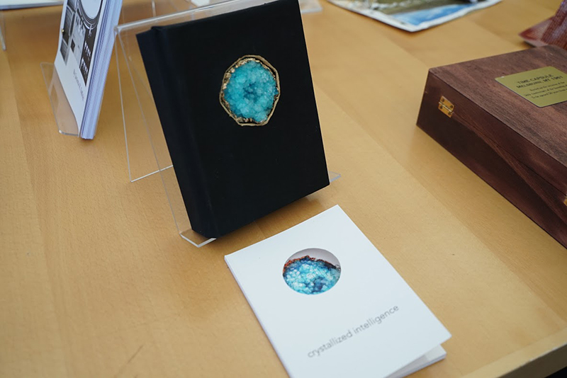
Mixed materials: (box), teal Borax crystal, gold leafing pen, book board, black glitter paper, Thai marbled tsunami paper, black bookcloth; (book) cardstock, cotton paper, and laser-printed transparency
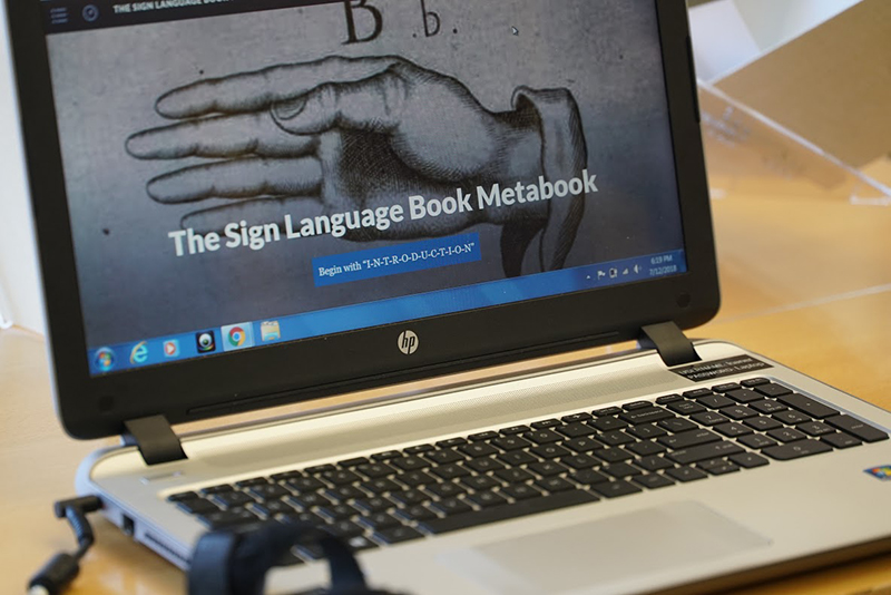
Prefatory Remark: Artist Statements as a genre have always seemed to me a bit pretentious and obscure. (Some people say this about philosophy, so perhaps I am casting stones at glass edifices.) Asking a philosopher to write an artist statement about a project that is as much a work of justice as it is aesthetic is asking for trouble. If you are reading this in hopes of illumination, I apologize—like many pieces of writing, this was born of procrastination and false starts, crafted in the wee hours before the exhibit opening, despite hours of thought beforehand.
Were I a more clever and daring philosopher, I would have started with a bon mot tying together my two endeavors while making reference to the state of my academic discipline in some quarters:
"Here is one hand ...” G .E. Moore
Were I, a brown signing Deaf woman, more willing to cash in on Deaf and other exoticism, I might quote the medieval deaf converso nun, Teresa de Cartagena:
“People marvel at what I wrote in the treatise and I marvel at what, in fact, I kept quiet, but I do not marvel doubting nor do I insist on my wonder.”
This work, however, was constrained—not by my skepticism or humility, but by the very infrastructure that contributes to the discrimination experienced by deaf people daily. To create a fully signed language book that captures enough of the contents in signed language isn’t just about the limits of technology—perhaps someday I’ll be working on my proposed signed language haptic hologram book for DeafBlind people—but the ways in which written spoken language permeates the materiality and conception of the work.
The ultimate building blocks of binary code of zeroes and ones might be conceptually free from sole association with written language (we can argue about that), but html markup uses the Roman alphabet (not a signed language manual alphabet) and from this builds written words from spoken English. It may be of interest that the manual alphabet used in American Sign Language (ASL) has the primary function of representing the spoken language translation of a word and is rarely used to create words in the ASL. Instead, the fingerspelled words are typically used as placeholders until a word (sign) emerges from the signing Deaf community. The open source multimedia platform Scalar that I sued to create this work is filled with written English language prompts and instruction; there are forced choices that require English text.
I quickly recognized that my vision of a wholly signed language book from the ground up would require building a platform from scratch with no written language words. This would nto be possible in a month.
Perhaps fittingly, then, this first signed language book project of mind, one that asks and attempts to answer philosophical questions about signed language book project of mind, one that asks and attempts to answer philosophical questions about signed language and books, is a bilingual hybrid, shaped by the dominant linguistic majority, just like signing deaf people who live in a spoken language world.
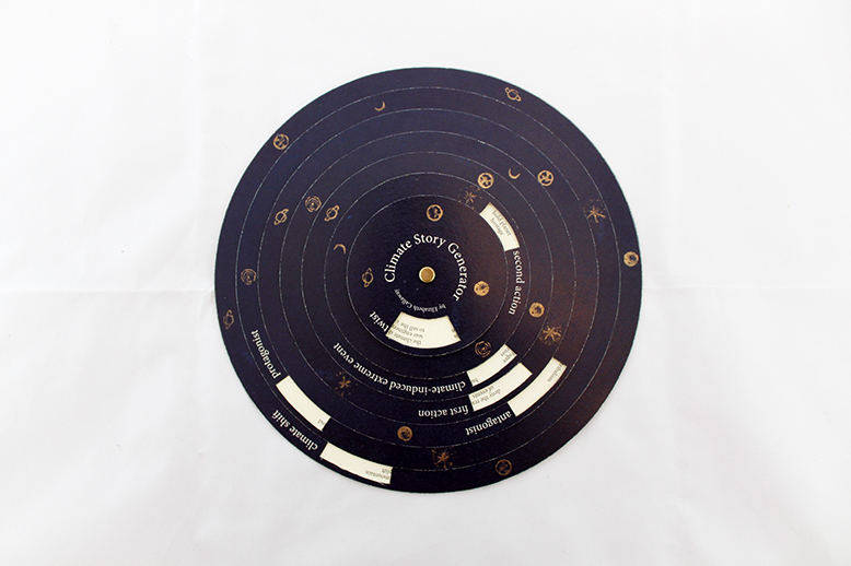
Climate change occurs on a slow scale, the effects of fossil fuel consumption are displaced across large distances, and climate is an abstraction that requires us to average weather over decades. But it is also essential that we understand the time-scales and narratives of climate shifts. A playful step in thinking about these problems, this volvelle invites the viewer to choose from options that create a narrative structure about planetary-scale climate shifts. Instead of focusing on the difficulty of representing climate change in art and literature, the piece points to how science fiction and fantasy have been telling climate stories for decades, while allowing the reader to come up with their own unique climate story. With only seven decision factors, this one piece can generate over four million possible climate stories.
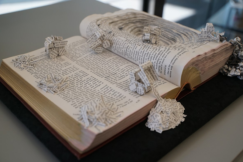
In the digital humanities, scholars often convert books to digital forms and use a computer to read them,a process known as "text mining." This piece literalizes that metaphor, creating a pit mine in a book about mining. These tiny trucks are doing "topic modeling," one of the most popular forms of text mining, where the computer combines co-occurring words into "topics." Three topics are being created here: one on machinery, one on land features, and one on explosions. Topic models also excise articles, conjunctions, prepositions, punctuation, and other common words. Images, too, are ignored, since text mining focuses entirely on the text. Accordingly, the piece features paper "equipment" that pushes unwanted material into two slag piles. "Text Mining" interrogates one of the central metaphors of the digital humanities, as well as reflects on the material mines that surround Salt Lake City.
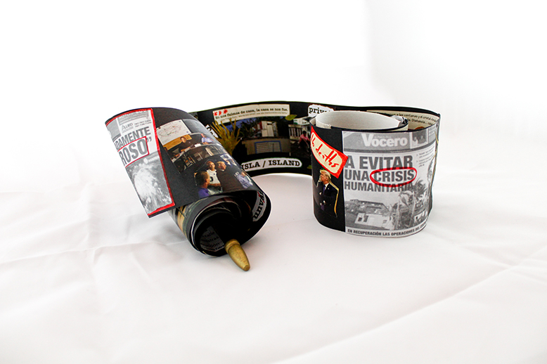
Este libro reflexiona sobre las tensiones de la información en tiempos de crisis. Se ocupa, específicamente, del paso del huracán María por Puerto Rico en septiembre de 2017 y las diversas narrativas que se han suscitado, sobre todo en el contexto de una isla amenazada también por un estatus político altamente problemático. El formato del pergamino retoma una de las formas más antiguas del libro, pero lo hace como metáfora del huracán y su movimiento continuo y concéntrico. El contenido—elaborado a través de la técnica del collage—muestra las tensiones y los límites difusos entre lo público y lo privado: en el lado externo del pergamino aparece lo público (la política, los titulares periodísticos, las miradas desde el afuera); y, por el interno, lo privado (la memoria, las narrativas del yo, la develación de lo doméstico). La inscripción de la artista/lectora queda plasmada en los trazos rojos que demarcan palabras claves dentro de un caos que va mucho más allá del fenómeno natural y se adentra en las complejidades de lo social y lo político.
This book deals with the tensions of information in times of crisis. It takes into consideration the aftermath of hurricane María in Puerto Rico since September 2017, and the diverse narratives it has raised, especially in the context of an island threatened by a highly problematic political status. The scroll format recaptures one of the earliest book forms, but it does it as a metaphor of the hurricane and its continuous and concentric movement. The content—crafted using the technique of the collage—shows the tensions and blurred lines between the public and the private: in the outer side of the scroll, there is the public (politics, newspaper headlines, views from afar); and, in the inner side, the private (memory, narratives of the self, the unveiling of the domestic space). The artist/reader’s inscription is embodied in the red traces marking up keywords of the chaos, a chaos that transcends the natural phenomenon and goes deep inside social and political complexities.
19.5 x 14 x 1
Book board, foam core, Canson papers, mylar
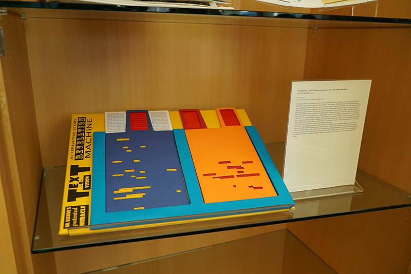
First and foremost, this book is meant to be interactive and revelatory. I like books that both “do” something and have an element of surprise for their reader. While books and art are serious business, they should never lose their sense of play. I chose a page from Joseph Conrad’s Heart of Darkness, partly because it’s linguistically dense and a single page could be made in multiple texts and partly because it’s a story of a protagonist journeying to find an answer in the middle of a mystery. I like that metaphor for something involving secret codes and hidden words. The Text-O-Vision cards that slide over Conrad’s page use a cardan grille, a code technology that originated in the sixteenth century. It is a form of steganography, which means “concealed, hidden, or protected writing.” Holes cut in the grille reveal secret messages that are hidden within plain sight. Only the reader with access to the grille has access to the concealed text. In this case, I made miniature stories/poems from Conrad’s work that only Text-O-Vision true believers can read.
The bright, carnivalesque colors and the inflated, hucksterish, fly-by-night language of the advertisement on the reverse side are part of the play but are also intended to be a comment on literary criticism and its tendency to embrace and lionize the next big theoretical thing which rarely ends up being as useful or revolutionary as it seems at first. Often, literary theory is little more than a brightly colored toy that only leads to certain dead-end answers, but it can still be fun to play with for a while.
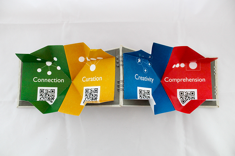
"Literacy In Flex" is a coil-bound, map-fold book that invites readers to think more critically about what reading and writing can look like in a digital age. We sometimes think of "reading" and "writing" as linear acts that only happen in a few narrow contexts. Symbols for representing literacy (e.g. the pencil, the typewriter, the bound book) tend to focus on literacy as a print-based practice when, in fact, many acts of literacy now happen in a variety of composing spaces, from digital spaces like laptops and smartphones to mobile paper spaces like Post-It notes and paper napkins. When we limit our vision of what "literacy" is to print-based practices, we, at best, narrow our imagination of what's possible when we read and write, and at worst, exclude or ignore visions of who can participate in literate acts. This book, therefore, lists four key literacy strategies for a digital age on each of the four colored panels. Scanning the QR codes on each panel will take users to a webspace I've created that defines each of these four strategies and examples of how those strategies could be enacted (via blog posts I wrote during my time at this NEH institute). The map fold book is intended to show that, when we "open up" our vision of what literacy can be, we experience an expanded sense of what literacy looks like. Therefore, when our conception of reading and writing is "in flex," we can invite a greater diversity of people to acts of reading and writing.
Paper, Paper Stickers, Sharpie, Ribbon
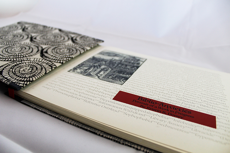
One way to understand the histories of the book, of reading, and of writing, is through the lens of anxiety. Concerns about authorship and authenticity, dangerous or objectionable content, the durability and materiality of the book, and the look and feel of the words on the page pervade conversations from the beginning of written communication.
This book, reflective of the early stages of a research project on the history of biblio-an:xieties, collects examples of books and book states that cause stress or discomfort in viewers, readers, and collectors. The scrapbook itself captures an intellectual project at early stages in which some elements (like concept) may feel relatively polished, but others (like execution of argument or specific examples) might feel messy or unfinished.
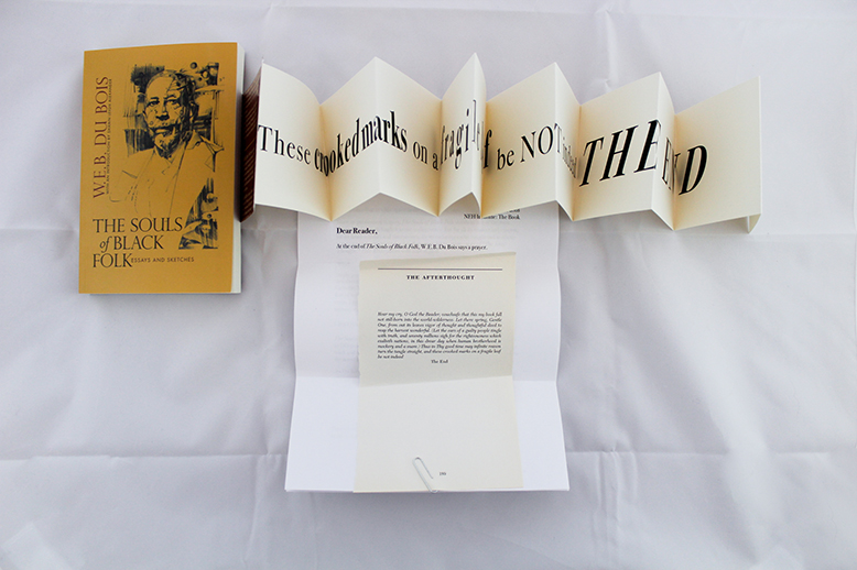
Dear Reader,
At the end of The Souls of Black Folk, W.E.B. DuBois says a prayer.
The Afterthought
Hear my cry, O God the Reader; vouchsafe that this my book fall not still-born into the world-wilderness. Let there spring, Gentle One, from out its leaves vigor of thought and thoughtful deed to reap the harvest wonderful. (Let the ears of a guilty people tingle with truth, and seventy millions sigh for the righteousness which exalteth nations, in this drear day when human brotherhood is mockery and a snare.) Thus in Thy good time may infinite reason turn the tangle straight, and these crooked marks on a fragile leaf be note indeed
The End
Italic letters float in white space in the center of the page.
Since its publication in 1903, The Souls of Black Folk stands as one of the most significant books in English in the 20th century. But for all its readers and renown, for its many scholars and interpreters, for its enduring social insight and aesthetic power and political relevance, hardly anyone takes serious note of “The Afterthought.” THE END passes with little regard.
Why?
Maybe people mistake it for an obligatory rhetorical gesture—a ritual benediction that thus ends a religious service, and that signals that you’re free to go. I grew up Catholic. When I entered or left church, I automatically dipped my hand into the font of holy water before crossing myself with a thoughtless flutter in the sign of the cross. I genuflected in and out of a pew. Is “The After-Thought” just another automatic “Amen”?
I don’t think so, reader.
The Souls of Black Folk is a work of art, but its aesthetics have a purpose. It exists to DO things IN the world. Du Bois’s intellectual and rhetorical achievement—his work and words made manifest in print and binding—are inert until someone read them and brings them to life.
So Du Bois make the reader a part of the book. From the beginning, he speaks directly to “you, Gentle Reader.”
Herein lie buried many things which if read with patience may show the strange meaning of being black here in the dawning of the Twentieth Century. This meaning is not without interest to you, Gentle Reader; for the problem of the Twentieth Center is the problem of the color-line.
That’s you. That’s me. That’s anyone who opened and read since it was published in 1903. And the problem of the color-line is our problem.
There’s also an “I” in Souls. It’s Du Bois. To read the book is to engage in a long conversation between you and him: the narrator whose presence and point of view is an essential part of the experience of reading, and of the meaning itself—the guide across two sides of “the veil,” the interpreter, the authority, the embodiment of what he aims to show and what he argues is possible and necessary to bring about racial justice.
At the end, in “The After-Though,” Du Bois again addresses “you,” the reader, but in a new way. “Hear my cry, O God the Reader.”
“O God the Reader.” One phrase, no comma between “God” and “the.”
To whom is he addressing this prayer? Is he naming the Christian God the ultimate reader, the ur-reader? Is he sanctifying the reader as a god? Either way, what matters her is that the Reader has the power of a god, to whom Du Bois now appeals. “Vouchsafe that this my book fall not still-born into the world wilderness.”
Du Bois exemplified the profound faith in the promise of print culture in 1903. He fulfilled his work as author and artist: to write well and truthfully, to base his claims in scholarship and craft, in the name of humanism, justice and antiracism. The magnificent book exists. He believe in this vision of THE BOOK.
But he also need to have faith in the reader. He knows that he ultimately relied on them to make good on the encounter: to change their mind, and to act “in this drear day when human brotherhood is mockery and a snare.”
What is the end of books? We give them life as we read them, and when we close the back cover, the end is the beginning. To realize this power, reader, after we take and read, we must take what we have read into the world beyond the last page, so “these crooked marks on a fragile leaf be not indeed THE END.”
Ex lectio,
Monique Dufour
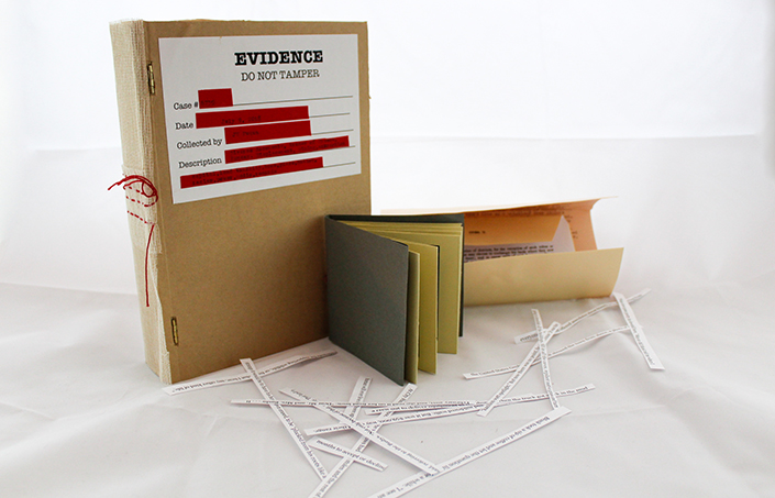
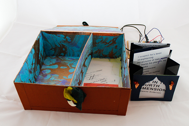
In 2012, the town of Treece, Kansas, in the southeastern part of state, was de-municipalized. Part of a government-funded relocation program after the environmental Protection agency identified as one of the most toxic parts of the country, the town of Treece ceased to exist. Residents were offered buy-outs for their homes and land; businesses were closed; schools were shuttered; farms were closed; families were moved; all public utilities and mail services were suspended. Official scientific readings in the area showed that even after 80 feet of soil dredging in the resident’s yards, toxic levels of lead and other heavy metal contaminants remained.
After decades of lead mining in Treece and the surrounding Tri-State Mining zone, lead and its byproducts had entered the watershed and the soil. Toxic to humans, with children being among the most vulnerable, lead remained in the human mountains of “chat” or “tailings” as debris from the mining industry. In addition, abandoned mines were collapsing in the area creating huge water-filled sinkholes. A result of radical undermining, the sinkholes threatened homes and other structures.
“Traces of Treece” asks how do we document an ongoing environmental disaster? What remains of extraction capital? What counts as “evidence”? This book is part of multiple-site research project. I make field trips to different environmentally precarious places. I take photographs, record ambient sound, make videos, collect materials, and note my impressions, This hand-made book references official evidence boxes yet it also shows the fragility of such collections. It exists in the zone between permanence and ephemerality. The book rests on a map of the areas with Treece at the center. The book is a wooden box that contains various fragments from official sources and less official ones. It offers bits rather than complete texts. It also rides on the hyphen between analog and digital as it includes typewritten text, digital photographs, and handmade stitching and folding.
When I see an evidence box, or any box for that matter, I wonder what it holds. What does this box hold? What does it say about Treece and about the effects of long histories of displacement, about the loss of home, and about the leftovers of extraction capital? I encourage you to read or skim the items and to shuffle through the slips of paper. The slips of paper are cut from a long story about Treece that was published in the New York Times.
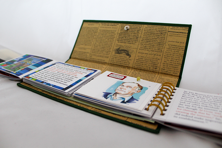
Undoubtedly our worlds have been shaped by shifts in information technologies, but too often we frame these changes as revolutions that wholly replace their predecessors. This rhetoric was particularly prevalent at the dawning of the "Digital Age," which was heralded simultaneously as the birth of the universal library and the death of the printed book. Handheld Devices seeks to problematize this schism by highlighting the parallels between printed books and more modern technologies, such as smart phones, in terms of how people use them-how we hold them, steal them, fight through them.
For succinctness, such connections between the analog and digital are presented here in primarily visual terms, paired with scholarly text. These are meant simply as provocations for thought and do not constitute a detailed or nuanced discussion of the innumerable complexities and important contexts in which they occur.
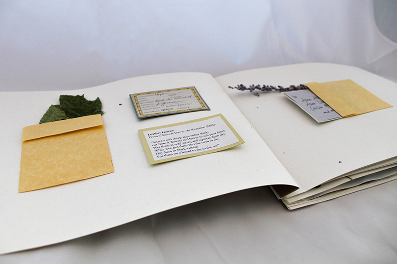
mixed media: plants, paper, ink, leather, ribbon
For Victorians, plants could be problems.
In the Encyclopedia of Gardening (1824), J.C. Loudon outlines plant preservation techniques for folks interested in cultivating their own herbaria, which books of pressed plants also known as horti sicci. Drying and pressing plants “between the leaves of books” is the most popular method, but not foolproof: “Several vegetables are so tenacious of their vital principle, that they will grow between papers.” Only after home-botanists “destroy the life of such” through “immersion in boiling water” or “application of a hot iron,” may they tape down and record the specimens.
This book, dry gardens[1], mimics the traditional form of the nineteenth-century herbarium in order to upend its aims. Rather than hermetically sealing and preserving plant life to guarantee a stable environmental archive, this book invites promising and potentially perilous encounters between plants and humans. The recto (front) of each page features arrangements of salvaged plants found throughout Salt Lake City that were documenting using popular nineteenth-century printing techniques, such the cyanotype “nature-print,” photocollage, and monotype. Showcasing this diverse body of printing practices serves to remind us of the machinery that rooted supposedly mimetic acts of environmental documentation within Victorian botanical cultures. Moreover, each print was handprinted, prompting prolonged plant-human interactions. In a departure from nineteenth-century custom, the verso (back) of each page includes the plant matter used to make each print in order to make visible and honor the typically effaced labor of vegetal life. dry gardens is bound with a simple bolt binding, which allows users to dissemble the book as they please so that they may add, take out, or rearrange prints. The book’s dedication to Anna Atkins, Anne Dixon, Cecilia Glaisher, & others acknowledges the contributions of Victorian women botanist-artists whose works have guided my own.
Rather than maintaining strict nonhuman-human distinctions, dry gardens characterizes the book as a dynamic space of encounter. In that spirit, you are encouraged to interact with the prints: touch them, smell, them, organize them as you see fit. You are also encouraged to take the plants out of their envelopes and even leave a souvenir behind should you desire. If the plants break, crumble, or turn to dust—don’t worry! More than simply preserving a sampling of Utah’s native plant specimens, this book is a document of ever-changing assemblages of plant-text-environmental-human materialities.
[1] English translation for horti sicci
Book cloth, book board, paper, plastic document envelope
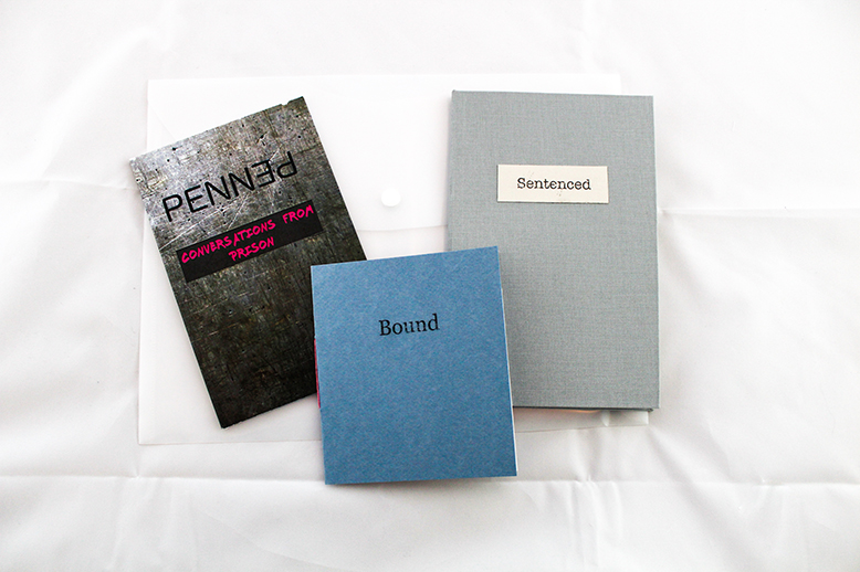
I spent twenty-seven months working in a men's medium security prison in the Midwest. I was the Librarian, a solo position that had previously been supported by a Library Technician but was no more. I served 1200+ Offenders, most of whom were in treatment for chemical dependency or sex offenses. With few exceptions, our Offenders would be released from prison within two to three years.
I collected notes, quotations, documents, and my own thoughts for the entirety of my time at the prison. I've sat on them for almost exactly a year now and I have been itching to turn them in to...something.
I thought long and hard about a form that's not a codex. Artist Book. Codex is too easy, not creative enough. But form should follow function. The print codex is the main form of access to books for prisoners. We had Playaways—self-contained MP3 audio books—but the vast majority of prisoners' lives revolves around print and their reading comes in codex form. Our social medium was print. Staff gave offenders information via paper memos. Offenders asked me for things via official forms called kites or by filling out a form I created for a specific library-related purpose. How natural that the form of the work I create would be bound within the same forms they are allowed to access.
The project as a whole is titled Contained and is housed in a transparent document envelope similar to the envelopes Offenders could buy to hold their documents and legal information. Many of the quotations I collected are the most striking or amusing without explanation so I created backgrounds in Illustrator and made comic panels using phraseit.net, a free online speech bubble program. Quotations from staff come from a replica of the radios we all carried and quotations from offenders take place in the library via the view from my office. Bubbles coming from the left indicate an offender clerk speaking and from the right indicate a library patron-always an offender. My own words are pointed toward the desk. Several striking kites were also replicated, though my responses to them are now locked on a DOC server somewhere for the foreseeable future. This book, titled Penned, is a perfect bound paperback with title text designed by my friend J. Calvin Smith, who was kind enough to create it for me unasked.
The casebound book is titled Sentenced and encompasses the things that were better conveyed through text. Blank pages were inserted when I came across something that should probably not be shared publicly-self-censorship that is common among prison staff. It is covered in grey bookcloth, a reference to the grey bins that contained all of an offender's possessions in prison. The bins were my original container inspiration but a fruitful conversation with book artist Johanna Drucker led me to a container that makes visual sense and didn't overwhelm my workload for the institute. Infinite thanks to Charlotte Howe for her help in setting the text in InDesign while I worked on another project and for lugging her foil stamping machine to campus for me.
The chapbook, Bound, contains this artist statement and is covered in paper that matches the offenders' uniforms.
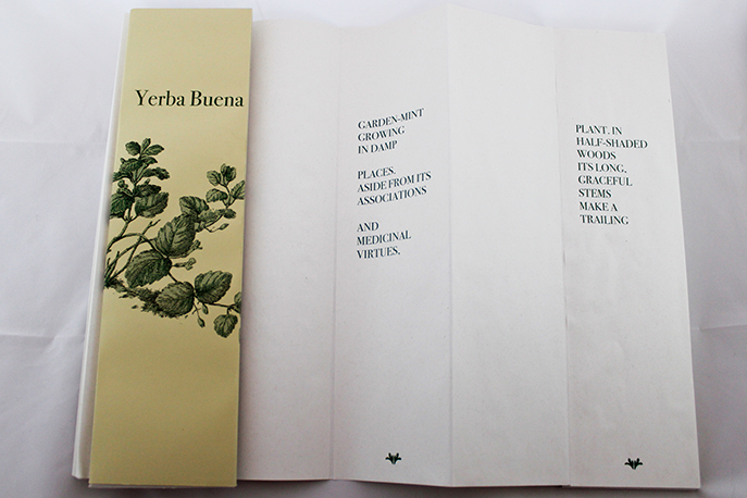
The content of this book originates from the “Yerba Buena” entry in The Wild Flowers of California: Their Names, Haunts, and Habits (1897). Written by Mary Elizabeth Parsons, it is an early guide to the state’s wildflowers.
On exhibit, this book uses the accordion structure to allow readers multiple ways of experiencing the text. Although a botanical entry may, at first glance, seem a relatively simple descriptive practice, here a reader might come to understand more of both the plants material details and also the changing culture and colonizing forces that shaped and reshaped the nature of that place.
How to Read This Book
The entry’s content has been bifurcated to both sides of the accordion book, alternating front to back and creating three possible texts. No words have been omitted or moved out of order from the original guide entry.
- Read across the front for language that describe attributes of the Yerba Buena plant.
- Read across the back panel for selections that emphasize the cultural landscape.
- Read collaboratively with another person to re-form the complete text. Move forward from the beginning of the front and back side of the book, alternating turns and panels.
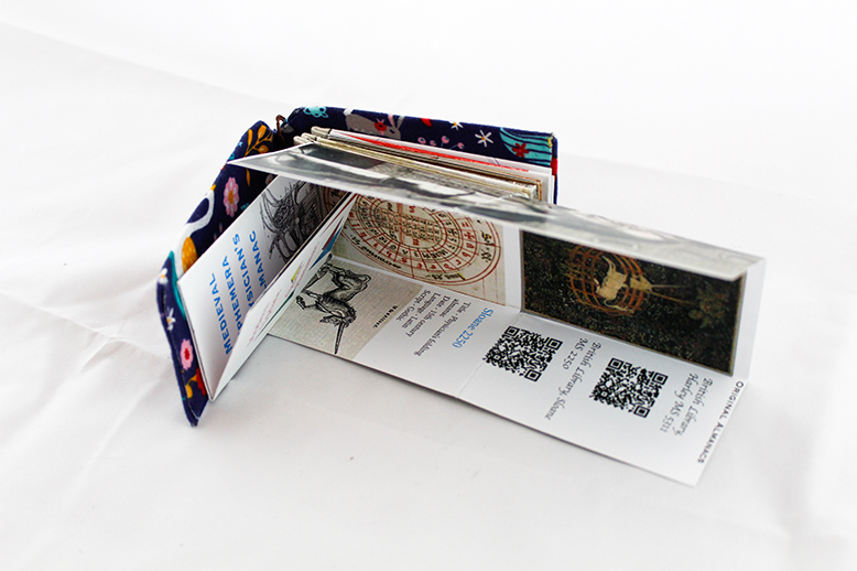
Medieval Ephemera offers a consideration of medieval book forms that fall outside common depictions of the medieval book as a fixed object. In contrast to the chained book or the prohibitively expensive Book of Hours, the folded almanac was ephemeral, inexpensive, and portable. Designed to hang from the belt, these almanacs were part of a group of books known as vade mecum (go with me) objects.
The almanac produced for this project combines a partial reproduction of two medieval physician’s almanacs (Harley 5311 and Sloane 2250) alongside a modern iteration of the form. Physician’s almanacs were designed to act as a quick reference for doctors as they traveled to their patients. Because astrology played a foundational role in Galanic medieval medical practice, the physician’s almanac typically contained a calendar, the Zodiac Man, eclipse charts, and guides for bloodletting based on the position of the stars.
The queer almanac offers a modern interpretation of the medieval form. Designed to act as a portable guide for navigating queer culture, it incorporates astrological charts alongside recent artwork and insider knowledge from queer culture.
Medium: Paper, thread, metal
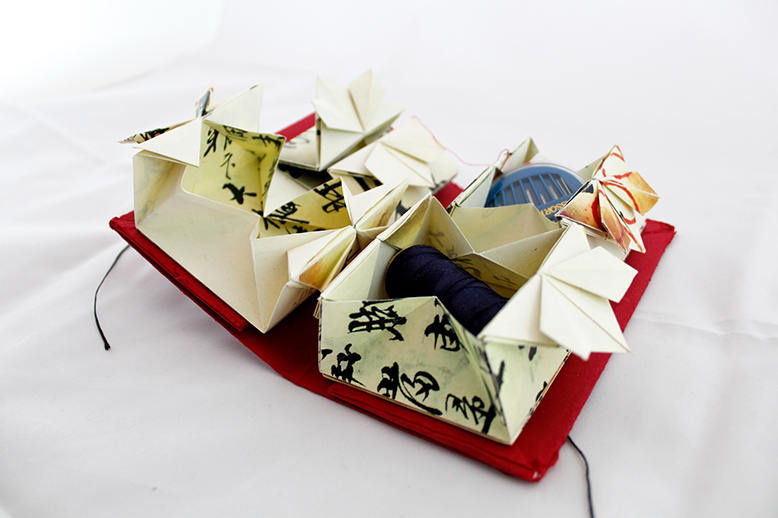
UN/FOLDING AKOENG’S BOOK (2018) is an exploration in representing childhood memory and family history; the tensions between cultural heritage, diaspora, and assimilation; and the desires to preserve and remember within the frames of inevitable bodily and material contingency that follow the effects of time, shifting space, and aging.
Using scanned pages from a manuscript of a remedy book authored by my late grandfather (circa unknown), I folded boxes to create a thread storage book or zhen xian bao, a traditional, declining Chinese folk art. Originally made by minority ethnic groups in China, these books were made to hold thread, needles, paper and fabric scraps, photos, and other personal and household ephemera. The boxes here hold fragments of the original manuscript and my grandmother’s sewing supplies.
I have vivid memories of my grandmother giving me needle and fabric to play with as a child. Her acts of care and touch can be collectively traced in our family thread by thread in our hemmed and patched pants, homemade pajamas, and pillowcases, showcasing mismatched patterns and textures—saved bits of fleece and cotton from various clothes her children and grandchildren had outgrown or left behind.
At its most broad, this project aims to prompt reflection on how books (and objects-as-books) transform and embody their makers, owners, and subjects in fluid ways, vacillating between being containers of memories and knowledge but also forgettings and obscurity. As one example, my grandfather’s writing is not only concealed by folds but also much of my family’s inability to read Classical Chinese. What does—and can—it mean, then, to “read” a text, if reading is always already precluded or becomes so? In a different vein, what meanings did books take on for my grandfather when he developed dementia in his later life? This book holds space for reading as simply material proximity; readers can interact with this book visually and tactilely by pulling open and discovering “hidden” compartments and looking at the stories it holds—it encourages a playful, imaginative type of reading that involves presence and no words at all.
This project grew out of an initial theme to make a book that interrogated the relationship between normative expectations of reading (involving comprehension, retainment, focus, rationality, etc.) and personhood in light of aging and age-related impairment. Upon receiving the manuscript my father had mailed me, I felt compelled to make something more personal. Many of the ideas that led to the iteration of this project were drawn from insightful discussions and guest lectures at the NEH Summer Institute, notably those on in/accessibility, literacy, and embodiment, as well as Gretchen Henderson’s injunction to “deform the book” (Galerie de Difformité, 2011), and my work as a doctoral candidate at the University of Michigan–Ann Arbor.
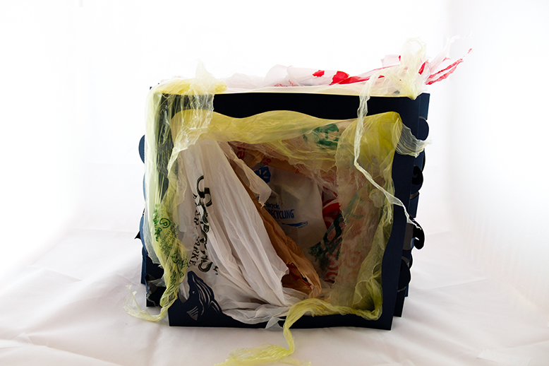
In early June, a small male pilot whale was found struggling, unable to swim or breathe, in a Thai canal near the Malaysia border. A necropsy revealed that almost 20 pounds of plastic bags and other plastic trash clogged the whale’s stomach, making it impossible for it to ingest food. The United Nations' environmental chief warned in December that humans are dumping eight million tons of plastic into the oceans every year. “At the current rate, we'll end up with more plastic in the oceans than fish by the middle of the century, and ultimately that comes back to our own food chain,” reports U.N. Environment Executive Director and Under-Secretary-General of the United Nations, Erik Solheim.
Ink on Paper
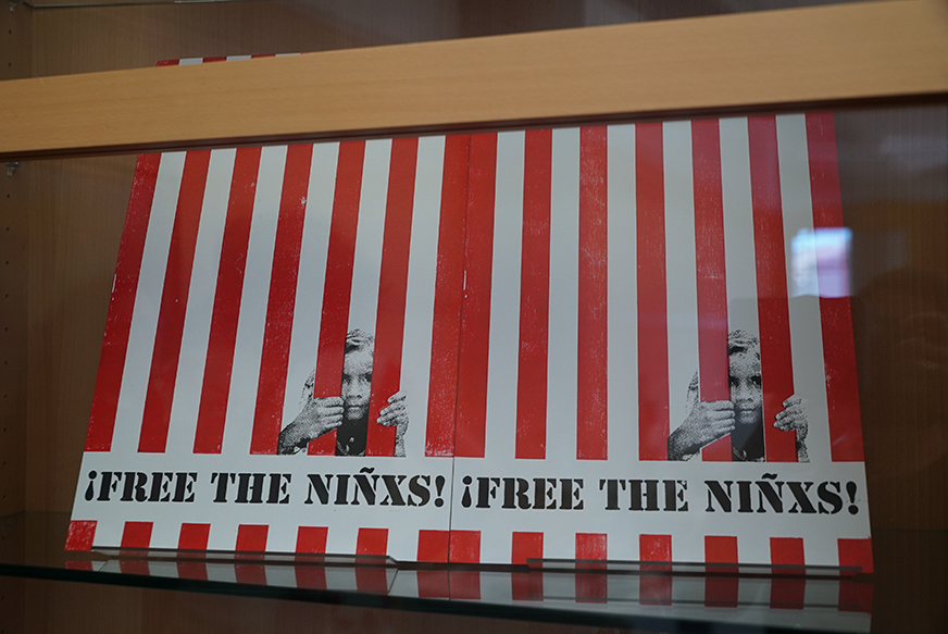
These posters were printed for the nationwide protests and marches that took place on June 30, in support of Families Belong Together. This organization resists the Trump administration’s zero-tolerance policy crackdown at the border. The posters became a rallying cry against the cruel, inhumane, and unjustified separation of children from their parents along the U.S. border with Mexico and at other ports of entry into the U.S. Participants carried them in protest of the conditions in which these children are kept. We marched to stress the irreversible trauma that has been perpetrated on these children and their parents for the crime of seeking a better life.
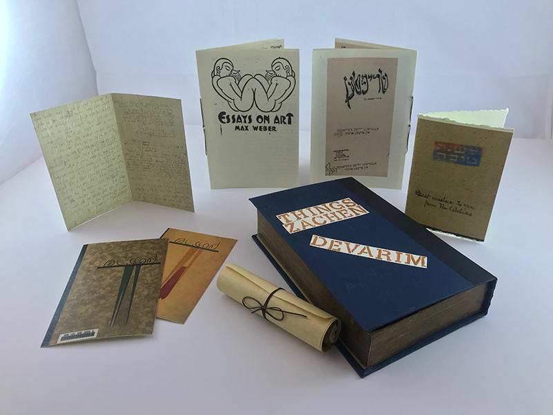
My book interrogates the relation between the sacred and the secular in modern Jewish writing—the distance between "the Book" and "the book." The trilingual title—English/ Yiddish/Hebrew—references a short article by the American Jewish artist Max Weber (Bialystok, Russia, 1881—New York, 1961). Weber's manifesto "Things" privileges the materiality of things as a model for aesthetic production. In "Things/Zachen/Devarim," Weber's essay appears in English and Yiddish alongside a scroll with passages from the biblical Book of Deuteronomy (Devarim, or "Things" in Hebrew); a colorful New Year's card with a woodcut from Weber to his friend, the painter Abraham Walkowitz, covers from Shriftn, the Yiddish “little magazine” where Weber’s work appeared; and images of Weber’s original handwritten manuscript in Yiddish, with changes by Weber’s friend, and Shriftn’s editor, Dovid Ignatieff. Material form has always shaped audience reception of text and story; artists like Weber and his contemporaries capitalized on the “aura” of sacred texts, creatively adapting them for distinctively modern purposes. However, the fate of Judaic sacred objects more broadly in the twentieth century also has a darker side. During the Holocaust, Jewish material culture was systematically destroyed—e.g., books pulped for paper, tombstones used to pave streets, prayer shawls turned into clothing, Torah scroll parchment used for paintings and to make furniture. Therefore, “Things/ Zachen/ Devarim” is also a memorial. I considered physically damaging my book in order to indicate this desecration of Jewish property and personal belonging. But the act of damaging this beautiful object that Ken so thoughtfully created for me seemed dismissive, too much like some simplistic performance art. Better--always better --to write; to produce; to MAKE SOMETHING; to make presence rather than absence. The material dimensions and features of this book were conceived during my stay in Salt Lake City at the NEH Institute, "The Book: Material Histories, Digital Futures," at the SLCC Publication Center. El Lizzitsky and Marc Chagall's playful, multilingual covers of interwar journals inspired the cover's graphics. The papers were chosen to mimic material qualities of the original artifacts: linen paper for Weber's handwritten draft, easily readable paper for his essays, a heavier stock for the journal covers and woodcut-qua-New Year's card, and something resembling parchment for the biblical scroll. The parchment was glued onto a piece of birch tree found while hiking in Big Cottonwood Canyon. The local, native bit of wood marks and honors the specifics of place that inspired "Things/Zachen/Devarim"—a community of scholar-makers set in a location whose unique social and geographic landscapes inform the shape of this work, both transcendent and concrete.
This project is inspired by images of various global art installations brought to the NEH Summer Institute by Anna Arnar, an art historian and guest lecturer.
It is also inspired by a childhood memory of the time my mother glued a shirt over the bikini model on her Shape Magazine.
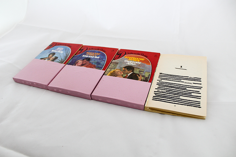
The project draws from the long tradition of banned books. Rather than focusing on systematic or authoritative censorship, it reflects self-imposed censorship. What we vehemently refuse to read, perhaps out of moral conviction or a feeling of intellectual superiority. What we consider "trash" and why.
It also explores the idea of subjective co-creation with a text—the experience each reader brings to (or lifts out of or re-interprets from) the book.
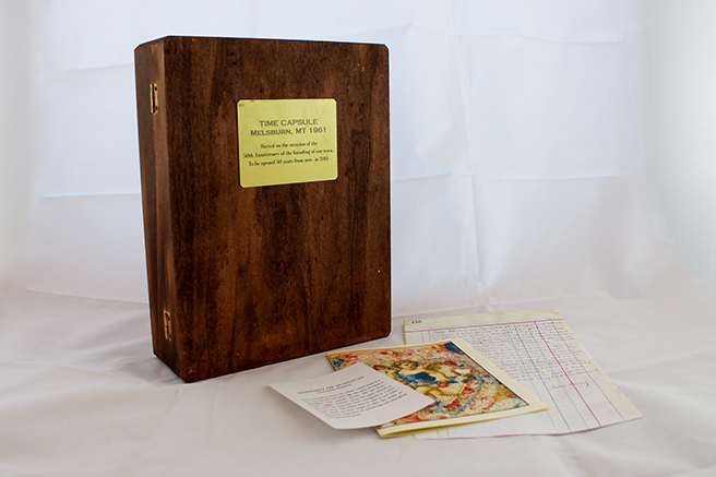
This is a book in a box. Or, rather, a short story in a box. I wrote the text years ago, the story revealed in epistolary time capsule entries. But the form—linear, tagged sections—never felt quite natural to me. Here the story has been reimagined in a more tactile form. The letters may be read in any order; this literal iteration hopes to offer the reader an enhanced experience of unearthing and untangling a long-buried secret.
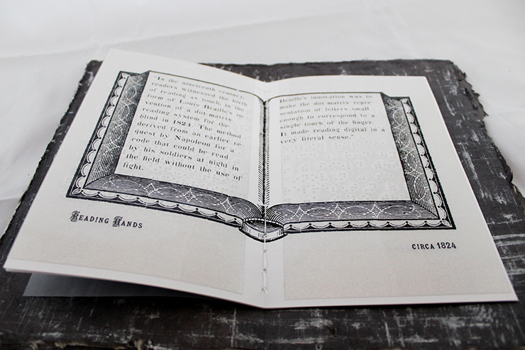
Hands and books have been inseparable from the very beginning of the codex, the monograph as we now know it. But even earlier, hands were a part of communication, a kind of signature or self-reference, a plea to an invisible god, a signaling device-all of the many functions that may be taken up or amplified by the book. Even in our new and emerging digital world of publishing, touch is an ever important factor. Most of us (who are able) want to see to experience, but every reader wants to feel. Even screens, which have attempted to supplant the printed book, have become more and more tactile. Touch is a language accessible to and seemingly desired by all.
How might a book embody this haptic, tactile relationship between hand and page? While still a highly visual book HAND BOOK plays with texture and touch in two different versions—one with a diaphanous, Mallarmean floating linen cover, the other with a coil binding that hints to the mostly industrial and technical meaning of "handbook." The pages within gloss through a history of hands, as described by Andrew Piper in his inaugural chapter of BOOK WAS THERE, with a few additions of the author's own placed in chronological sequence (i.e. painted cave hands. talking hands. hand turkeys, and library hand). Vellum scanned hands, watermarks recalling ancient cave paintings, a Braille overlay (duplicating the text printed underneath), and 3-D "hand turkeys" complete with googly eyes all present hands in different textural ways. The book's text, mostly quotations from Piper's tome, are rendered in genuine Victorian fonts, embellished with newspaper illustrations from the same period, lovingly digitized and made available by the Walden Font Company. Finally, two pages include an additional augmented reality layer, an incarnation of Mallarme's notion of a truly multi-layered text-but these "couches" as he called them are only accessible by gesture; the reader must hover her hands above the text while holding a modern embodiment of a boundless book.
Wood
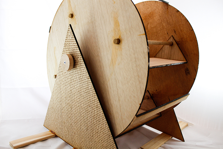
The human obsession with absorbing information efficiently inspired innovations over the centuries that are now taken for granted: spacing between words, punctuation, page numbers, footnotes, chapters, headings, subheadings, table of contents and indices-each of these are designed to aid the consumption of information. The proliferation of books after 1500 (and their lower cost) made an increasing amount of information available to a growing reading public. This insatiable demand for information—what one scholar calls "info-lust"[1]—created an unforeseen problem for readers: How do you manage so much information and, more importantly, how do you make it usable? In 1587, the Italian engineer Agostino Ramelli offered a solution: the bookwheel. In his words, the bookwheel is
a beautiful and ingenious machine, very useful and convenient for anyone who takes pleasure in study. . . For with this machine a man can see and turn through a large number of books without moving from one spot. More over, it has another fine convenience in that it occupies very little space in the place where it is set.[2]
The brilliance of Ramelli's design was the integration of an intricate system of cogs and wheels to keep books in place while the wheel circulated. Ramelli envisioned that readers would commission a master craftsman to construct personalized bookwheels, based on his design, for their private libraries. His bookwheel may be seen as a conscious attempt to replace the various types of rotating desks that scholars had used in monastic libraries for centuries. The key innovation of Ramelli's bookwheel was his introduction of a horizontal, rather than a vertical, axis, which reduced the amount of floor space required while increasing the number of books that could remain open for scholarly use. Ramelli claimed his bookwheel would serve humanist-inclined scholars whose reading habits required frequent cross-referencing of texts, or whose physical condition restricted movement.
And yet, Ramelli never actually constructed his "ingenious" design. Scholars debate whether it was intended less to help actual readers, and more to flaunt his not inconsiderable knowledge of mechanics.[3] Whatever his true intention, the idea of a mechanical reading wheel continued to fascinate thinkers for centuries. The most famous example is the French inventor Grollier de Serviere, whose simplification of Ramelli's design in 1 719 eliminated the system of cogs and wheels. Instead, he simply hung the shelves independently and allowed gravity to keep them in place (pictured bottom, right). As far as we know, he did not bother to make a working model, either. Nevertheless, both inventors inspired dozens of others to construct bookwheels, but, even then, the vast majority were commissioned by royalty or powerful institutions. The fact is they were prohibitively expensive. Private commissions often are. What is more is that most scholars liked to read books side by side for easier comparison. The bookwheel's vertical movement did not allow this. It was also rather cumbersome to write notes while using the bookwheel. While in theory a fascinating piece of technology, it was in practice more ornamental than functional. Thus, far from being a useful technology for individual scholars (as Ramelli imagined), the bookwheel's true significance is that it symbolizes the human drive to collect, organize, and synthesize information. It is a compulsion we share with sixteenth century humanists. Having a dozen browser tabs open on our computers as we check our phones for notifications on social media is not a new experience, but simply a more technologically advanced expression of the same impulse that led Ramelli and de Serviere to conceive of their mechanical information management devices, however impractical theirs actually were.
The bookwheel before you was designed using vector graphics, "printed" with meranti as the material, which was cut and etched with a laser engraver. Though inspired by Ramelli's bookwheel, its design is closer to the spirit of de Serviere's design. Like them both, it symbolizes the human drive to collect and store information.
[1] See Ann Blair, Too Much to Know: Managing Scholarly Information before the Modern Age (Cambridge, MA: Harvard University Press, 2010), 6.
[2] The Various and Ingenious Machines of Agostino Ramelli (1588), trans. Martha Teach Gnudi (Baltimore: The Johns Hopkins University Press, 1976), 508-509.
[3] See, for example, Bert S. Hall, “A Revolving Bookcase by Agostino Ramelli,” Technology and Cuture 11, no. 3 (July 1970), 389-400. See also John Considine, “The Ramellian Bookwheel,” Erudition and the Republic of Letters 1, no. 4 (2016): 381-411.
![]()
Arduino, thermal printer, paper
The term "ephemera" comes from the mayfly, who lives only for a day. In printed matter, ephemera is anything not intended to be kept: printed cheaply and quickly, destined for the trash. Today we think about the ephemeral more than ephemera. Mailed postcards or handwritten notes are replaced by text messages or emails, digital communications that seem to appear and disappear without a body. Of course all communications are material, even when material or medium is constantly undergoing translation: neurons, circuits, wires, codes.
These ephemera print out once an hour, a reminder of what it means to live only for a day.
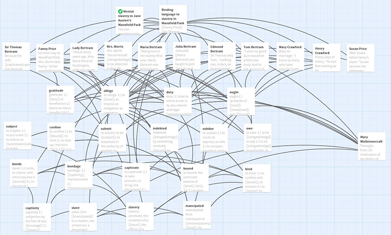
Mansfield Park remains one of Jane Austen's most controversial novels. Readers of her work often raise two major issues: Fanny Price's position as the novel's heroine and the text's presentation of, and attitude toward, slavery. Many scholars contend that Fanny Price is Austen's least likable heroine because she persistently adheres to the many constricting rules imposed on her by everyone at Mansfield Park. Fanny is certainly no Elizabeth Bennet, the tenacious heroine of Pride and Prejudice. Fanny does, however, refuse Sir Thomas Bertram's demand that she wed Henry Crawford, an eligible and wealthy bachelor in higher economic and social standing and instead marries her true love, Sir Thomas's son Edmund. Slavery in the novel is a far more fraught and contentious issue. Fanny's uncle, Sir Thomas, owns a slavery plantation in Antigua, and at one point the novel notes that problems on the plantation force Sir Thomas to make a voyage to the island. When he returns, Fanny asks her uncle about his plantation and the slave trade but is met with silence. Some argue that the silence surrounding Fanny's question represents Austen's own silent pro-slavery and imperialist sentiments. Others, however, argue that Mansfield Park is an abolitionist novel that aligns Fanny with black slaves in order to suggest that Britain makes slaves of women on the marriage market.
Why Twine?
This Twine storyboard intervenes in these two conversations by showing the ways in which the language Austen employs in Mansfield Park connect Fanny—and indeed, every character in the novel--to mental slavery. The novel carefully employs the words "gratitude," "oblige," "duty," and "ought" in ways that forcefully constrict the minds and movements of characters, especially Fanny. A word like "gratitude" seems innocuous to us today, denoting appreciation for some act. When Austen was writing, however, "gratitude" could denote someone's "duty" to another. In other words, "gratitude" indebted one individual to another. In Mansfield ParkFanny and others often owe enormous--seemingly insurmountable--debts to others, usually men, throughout the novel. Fanny believes she must think, act, and even believe what others tell her because of her gratitude--a gratitude that mentally enslaves her. "Oblige," "duty" and "ought" work to enslave Fanny mentally, as well. These words operate as chains of signfication, preventing Fanny and others in the novel from exercising their free will. This Twine hopes to show that Austen did not compare Fanny to black slaves but rather depicts the ways in which patriarchy mentally enslaves her and others in the novel.
What This Storyboard Hopes to Achieve
Connecting "gratitude," "oblige," "duty," and "ought" to slavery is more than a literary interpretive maneuver. As this storyboard shows, contemporary dictionaries show the interconnected nature of these terms and their close proximity to words denoting slavery, including "slave," "captivity," and "mancipated." The Twine helps reveal the novel's obsessive interest in exploring how language mentally enslaves characters in the novel. In addition, Austen's contemporaries often described language's ability to enslave young people, especially little girls. To help offer this context, this story offers portions of Mary Wollstonecraft's A Vindication of the Rights of Woman(1792). Wollstonecraft argues that parents prepare little girls for the "slavery" of marriage in, to use her words, the "political and civil sense." Scholars generally agree that Austen was was very likely familiar with Wollstonecraft and her work.
With these things in mind, experience the endless chains of signification offered in this Twine storyboard on "Binding Language to Slavery in Mansfield Park."